 .
.
Case-Control Study: How Alzheimer’s Disease Affects Gene Expression#
This tutorial demonstrates causarray on a case-control single-cell study, showing that the same doubly-robust framework used for perturb-seq also applies to observational disease comparisons.
Scientific question: Which genes are differentially expressed in excitatory neurons of AD-dementia donors compared to cognitively normal aging donors, after controlling for inter-individual confounders?
Important framing: The
tau(log-fold change) estimates describe how gene expression differs between AD and normal donors — i.e. how AD is associated with gene changes. They do not imply that the gene changes cause AD.
Pipeline:
preprocess_sea_ad.py  →  sea_ad_mtg_exneu_pb.h5ad   (85 donors × 22 911 genes)
         |
         v  prep_causarray_data
      Y, A, X_cov
         |
         v  estimate_r  →  select r = 4 (JIC criterion)
         |
         v  fit_gcate   →  4 latent confounders U
         |
         v  LFC         →  doubly-robust log-fold changes per gene
[1]:
import os
import numpy as np
import pandas as pd
import scipy.sparse as sp
import seaborn as sns
import matplotlib.pyplot as plt
import scanpy as sc

import causarray
print('causarray version:', causarray.__version__)
from causarray import (
    prep_causarray_data, fit_gcate, LFC, estimate_propensity_scores,
    summarize_propensity_scores, plot_propensity_scores,
)
causarray version: 0.0.8
Why pseudo-bulk?#
Single-cell RNA-seq data presents two practical challenges for case-control analysis:
Scale: A typical snRNA-seq study has millions of cells. Running a GLM on millions of rows is slow and, more importantly, the observational unit here is the donor, not the cell.
Sparsity: Each individual cell captures only a small fraction of its transcriptome (most entries are zero), making cell-level counts very noisy.
Pseudo-bulking solves both by summing raw counts across all cells from the same donor:
The result is a donor × gene matrix of aggregated counts — comparable in structure to bulk RNA-seq — where each row represents one biological replicate (one person). This is the appropriate unit for causal inference about disease status.
Preprocessing note: The pseudo-bulk file used here was created by
preprocess_sea_ad.py(included in this directory). It downloads all 9 MTG excitatory-neuron subclasses from CellxGene Census, subsamples up to 300 cells per donor from the combined set, sums counts per donor, and filters genes withmax(pseudo-bulk count) ≤ 10.⚠ Caution: Keep the total cells per donor reasonable (~300) — summing thousands of cells inflates counts and can cause NB-GLM numerical issues. This tutorial and the paper both aggregate by donor only. If cell-type labels are available and the cohort is large, you can alternatively pseudo-bulk within each cell subtype per donor, which increases the effective sample size at the cost of a larger model.
The core pseudo-bulk operation is just a grouped sum of the count matrix:
# Conceptual illustration (not run here — see preprocess_sea_ad.py)
import anndata as ad, numpy as np, scipy.sparse as sp
X = adata.X.toarray().astype(np.int32)   # cells × genes, raw integer counts
donors = adata.obs['donor_id'].unique()
X_pb = np.vstack([
    X[adata.obs['donor_id'] == d].sum(axis=0)
    for d in donors
])
pb = ad.AnnData(X=sp.csr_matrix(X_pb), obs=..., var=adata.var)
Load data#
[2]:
pb = sc.read_h5ad('sea_ad_mtg_exneu_pb.h5ad')
pb
[2]:
AnnData object with n_obs × n_vars = 85 × 22911
    obs: 'sex', 'disease', 'self_reported_ethnicity', 'development_stage', 'n_cells', 'library_size', 'age', 'trt', 'sex_bin'
    var: 'feature_name'
[3]:
# Donor-level metadata
pb.obs[['sex', 'disease', 'trt', 'age', 'n_cells', 'library_size']].head(10)
[3]:
| sex | disease | trt | age | n_cells | library_size | |
|---|---|---|---|---|---|---|
| donor_id | ||||||
| H19.33.004 | female | normal | 0 | 80.0 | 300 | 9262925 |
| H21.33.019 | male | normal | 0 | 75.0 | 300 | 12793728 |
| H21.33.004 | male | normal | 0 | 80.0 | 300 | 16071238 |
| H21.33.017 | female | dementia | 1 | 80.0 | 300 | 6558591 |
| H20.33.041 | female | dementia | 1 | 80.0 | 300 | 11428154 |
| H20.33.015 | male | dementia | 1 | 88.0 | 300 | 13513747 |
| H21.33.014 | male | normal | 0 | 80.0 | 300 | 12540262 |
| H21.33.045 | female | dementia | 1 | 80.0 | 300 | 4951466 |
| H21.33.026 | female | normal | 0 | 80.0 | 300 | 8192575 |
| H20.33.039 | female | normal | 0 | 80.0 | 300 | 10879269 |
Exploratory data analysis#
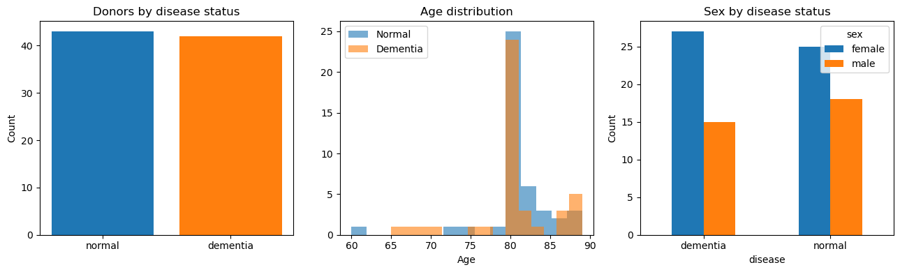
[4]:
fig, axes = plt.subplots(1, 3, figsize=(13, 4))

# Case / control counts
counts = pb.obs['disease'].value_counts()
axes[0].bar(counts.index, counts.values, color=sns.color_palette()[:2])
axes[0].set_title('Donors by disease status')
axes[0].set_ylabel('Count')

# Age distribution
for trt, grp in pb.obs.groupby('trt'):
    label = 'Dementia' if trt == 1 else 'Normal'
    axes[1].hist(grp['age'], bins=15, alpha=0.6, label=label)
axes[1].set_xlabel('Age')
axes[1].set_title('Age distribution')
axes[1].legend()

# Sex distribution
sex_trt = pb.obs.groupby(['disease', 'sex']).size().unstack(fill_value=0)
sex_trt.plot(kind='bar', ax=axes[2], rot=0)
axes[2].set_title('Sex by disease status')
axes[2].set_ylabel('Count')

fig.tight_layout()
plt.show()
Prepare causarray inputs#
Key difference from perturb-seq tutorials: here A is a single binary column (AD = 1, cognitively normal = 0), and Y is a donor × gene pseudo-bulk matrix rather than a cell × gene matrix.
[5]:
Y = pd.DataFrame(
    pb.X.toarray() if sp.issparse(pb.X) else pb.X,
    index=pb.obs.index,
    columns=pb.var_names,
)

# Treatment: 1 = AD/dementia, 0 = normal aging
A = pb.obs[['trt']].astype(float)

# Covariate: sex (binary)
X_cov = pb.obs[['sex_bin']]

# prep_causarray_data validates shapes, adds intercept column, returns arrays
Y, A, X_cov, X_A = prep_causarray_data(Y, A, X_cov)

print(f'Donors (n): {Y.shape[0]}   Genes (p): {Y.shape[1]}')
Donors (n): 85 Genes (p): 22911
Number of latent factors#
We estimate the number of unmeasured confounders r using the JIC criterion. JIC is a penalised-likelihood score; the optimal r minimises it.
Unmeasured confounders in this study include post-mortem interval (PMI) effects, inter-individual transcriptional variation, and technical batch effects.
[6]:
from causarray import estimate_r, plot_r

# Uncomment to recompute (takes ~5-10 min):
# df_r = estimate_r(Y, X_cov, A, np.arange(2, 16, 2))
# df_r.to_csv('sea_ad_r.csv', index=False)
df_r = pd.read_csv('sea_ad_r.csv')
fig = plot_r(df_r)
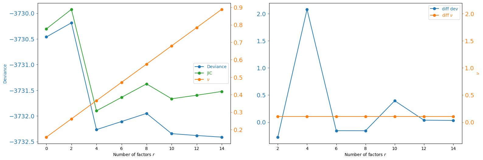
The JIC is stable from r=4 to r=14 with minimal penalty differences, indicating limited unmeasured confounding after proper pseudo-bulk normalisation. We select r = 4 — the first minimum of the JIC curve.
Estimate latent confounders (GCATE)#
[7]:
import pickle

_pkl = 'sea_ad_gcate.pkl'
if os.path.exists(_pkl):
    print(f'Loading pre-computed GCATE from {_pkl}')
    with open(_pkl, 'rb') as f:
        res_1, res_2 = pickle.load(f)
else:
    r = 4   # JIC-selected value; see estimate_r cell above
    res_1, res_2 = fit_gcate(Y, X_cov, A, r, offset=True, verbose=True)
    with open(_pkl, 'wb') as f:
        pickle.dump((res_1, res_2), f)

U = res_2['U']
print(f'Step 1 -- epochs: {res_1["n_iter"]},  best NLL: {min(res_1["hist"]):.6f}')
print(f'Step 2 -- epochs: {res_2["n_iter"]},  best NLL: {min(res_2["hist"]):.6f}')
Loading pre-computed GCATE from sea_ad_gcate.pkl
Step 1 -- epochs: 6,  best NLL: 4.762699
Step 2 -- epochs: 6,  best NLL: 4.788035
Propensity-score and positivity diagnostics#
In this observational comparison, positivity asks whether dementia and normal-aging donors have comparable values of the covariates used in the treatment model: sex and the four estimated latent factors. We estimate five-fold out-of-fold propensity scores so that an overfit model cannot diagnose its own training separation. class_weight='balanced' matches the propensity model used by LFC; because the groups contain 43 and 42 donors, balancing has little effect here.
The table reports histogram overlap, the fraction of scores outside [0.05, 0.95], and inverse-weight effective sample size (ESS). These summaries are complementary: histogram overlap describes the overall score distributions, whereas ESS is sensitive to a small number of influential inverse weights.
[8]:
# Use the same observed and estimated covariates as the LFC propensity model.
W = np.c_[X_cov, U]
pi_oof = estimate_propensity_scores(
    A, W, K=5, class_weight='balanced', random_state=0,
)
ps_summary = summarize_propensity_scores(A, pi_oof)
display(ps_summary)

fig, axes, _ = plot_propensity_scores(A, pi_oof, treatments=['trt'])
plt.show()
| treatment | n_control | n_treated | prevalence | overlap_ratio | auc | brier_score | outside_overlap_fraction | clipped_fraction | ess_control | ess_treated | ess_control_fraction | ess_treated_fraction | score_q01 | score_median | score_q99 | |
|---|---|---|---|---|---|---|---|---|---|---|---|---|---|---|---|---|
| 0 | trt | 43 | 42 | 0.494118 | 0.777409 | 0.338317 | 0.276904 | 0.0 | 0.0 | 42.165403 | 40.673381 | 0.980591 | 0.968414 | 0.302618 | 0.495747 | 0.656655 |
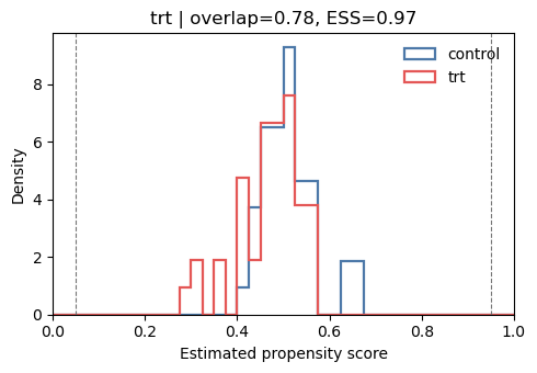
Interpretation. The out-of-fold overlap ratio is 0.777, no scores fall outside [0.05, 0.95], and the control and dementia ESS values retain 98.1% and 96.8% of their nominal sample sizes. The central 98% of scores lies between 0.303 and 0.657. Taken together, these results indicate strong common support: extreme propensity weights are unlikely to drive the SEA-AD estimates, and neither overlap restriction nor stronger regularisation is needed to repair positivity.
The out-of-fold AUC is 0.338 and the Brier score is 0.277, slightly worse than the approximately 0.25 Brier score from predicting the nearly balanced prevalence for every donor. This suggests that sex and the estimated latent factors do not predict disease status stably out of sample, which is plausible with only 85 donors. It is a nuisance-model precision warning rather than evidence of poor overlap. If conclusions depend strongly on the propensity adjustment, alternative regularisation or
calibrated (class_weight=None) scores can be reported as sensitivity analyses; model tuning should be based on out-of-fold prediction and stability of the final estimates, not on making the overlap plot look better.
Estimate log-fold changes#
Each gene’s tau is the doubly-robust estimate of how much its expression changes (on the log scale) in AD relative to normal aging, after adjusting for sex and the r latent confounders captured by GCATE.
Choosing pooled versus unequal variance#
Each row is an independent donor-level pseudo-bulk profile, but independence does not imply equal variability between the 43 normal-aging and 42 dementia donors. Disease severity, inter-individual response, residual cell-subtype composition, and library-size variation can all make the gene-wise variance differ between the two groups. With only about 40 donors per arm, that equality is difficult to justify reliably.
We therefore use usevar='unequal' (Welch), which estimates the two arm variances separately and uses gene-specific Welch–Satterthwaite degrees of freedom. This choice is more robust to heteroskedasticity and avoids the large increase in discoveries produced by pooled inference in this dataset. Pseudo-bulking and Welch variance address different issues: pseudo-bulking makes the donor the independent observational unit, whereas Welch inference allows those independent disease groups to have
different variances.
[9]:
# Use GCATE-internal size factors as log-scale offset (same normalization as GCATE fitting)
offsets = np.log(res_2['kwargs_glm']['size_factor'])

# Concatenate observed covariates with latent factors
W = np.c_[X_cov, U]

df_res, estimation = LFC(Y, W, A, W, offset=offsets, usevar='unequal', verbose=True)
'Estimating LFC...'
{'a': 1, 'd': 6, 'd_A': 6, 'estimands': 'LFC', 'n': 85, 'p': 22911}
{'offset': array([-0.06330679,  0.36236182,  0.56863386, ...,  0.17991812,
        0.1505303 ,  0.4616399 ], shape=(85,)),
 'random_state': 0,
 'verbose': True}
'Fit propensity score models...'
{'C': 1.0,
 'class_weight': 'balanced',
 'fit_intercept': False,
 'random_state': 0,
 'verbose': False}
'Fit outcome models...'
'Fitting nb GLM (fast)...'
'Estimating AIPW mean...'
[10]:
# Collect results
results = df_res.copy()

n_rej_fdr = (results['padj'] < 0.1).sum()
print(f'FDR-controlled (BH, q<0.1): {n_rej_fdr}')
results.head()
FDR-controlled (BH, q<0.1): 2719
[10]:
| gene_names | tau | std | log2fc | log2fc_se | stat | rej | pvalue | padj | pvalue_emp_null_adj | padj_emp_null_adj | mean_control | mean_treated | estimable | |
|---|---|---|---|---|---|---|---|---|---|---|---|---|---|---|
| 0 | LINC01409 | 0.048288 | 0.070912 | 0.069664 | 0.102305 | 0.680950 | 0.0 | 0.497849 | 0.779561 | 0.643971 | 0.997089 | 327.059759 | 343.240203 | True |
| 1 | NOC2L | 0.080213 | 0.051780 | 0.115723 | 0.074703 | 1.549118 | 0.0 | 0.125426 | 0.407990 | 0.296144 | 0.965711 | 108.311639 | 117.357630 | True |
| 2 | ENSG00000272512 | -0.323448 | 0.400321 | -0.466637 | 0.577541 | -0.807972 | 0.0 | 0.421445 | 0.726277 | 0.587624 | 0.997089 | 3.137438 | 2.270405 | True |
| 3 | HES4 | -0.620613 | 0.226767 | -0.895356 | 0.327156 | -2.736784 | 0.0 | 0.007604 | 0.075115 | 0.067817 | 0.665220 | 70.762985 | 38.043211 | True |
| 4 | ISG15 | -0.365598 | 0.205004 | -0.527446 | 0.295759 | -1.783367 | 0.0 | 0.078509 | 0.315687 | 0.231939 | 0.929551 | 16.221286 | 11.254033 | True |
Visualise results#
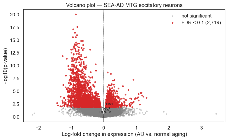
Each point in the volcano plot is a gene. The x-axis shows tau — the estimated log-fold change in expression associated with AD. The y-axis is statistical significance. Genes to the right are up-regulated in AD; genes to the left are down-regulated.
[11]:
sns.set(font_scale=1.1, style='white')

fig, ax = plt.subplots(figsize=(8, 5))

# Colour by FDR significance
fdr_sig = results['padj'] < 0.1
ns  = results[~fdr_sig]
sig = results[fdr_sig]

ax.scatter(ns['tau'],  -np.log10(ns['pvalue']),  s=8,  alpha=0.3, color='gray',    label='not significant')
ax.scatter(sig['tau'], -np.log10(sig['pvalue']), s=10, alpha=0.8, color='tab:red', label=f'FDR < 0.1 ({len(sig):,})')

# Annotate selected neuronal genes with known AD relevance
annot_genes = ['BIN1', 'APP', 'MAPT', 'PICALM']
for gene in annot_genes:
    row = results[results['gene_names'] == gene]
    if len(row):
        ax.annotate(gene, xy=(row['tau'].values[0], -np.log10(row['pvalue'].values[0])),
                    fontsize=8, ha='center', va='bottom')

ax.axvline(0, color='k', linewidth=0.5, linestyle='--')
ax.set_xlabel('Log-fold change in expression (AD vs. normal aging)')
ax.set_ylabel('-log10(p-value)')
ax.set_title('Volcano plot — SEA-AD MTG excitatory neurons')
ax.legend(frameon=False)
fig.tight_layout()
plt.show()
[12]:
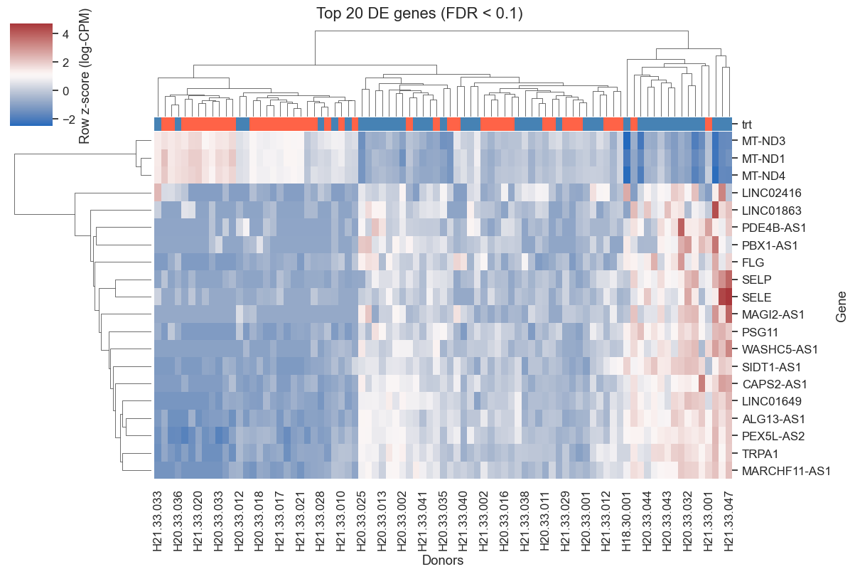
# Top 20 FDR-significant genes by |tau|, excluding unannotated ENSG-only entries
top_genes = (
    results[results['padj'] < 0.1]
    .assign(abs_tau=lambda d: d['tau'].abs())
    .loc[~results['gene_names'].str.startswith('ENSG')]
    .nlargest(20, 'abs_tau')['gene_names']
    .tolist()
)

if top_genes:
    X_top = pb[:, pb.var_names.isin(top_genes)].X
    if sp.issparse(X_top):
        X_top = X_top.toarray()

    # Log-CPM for display
    lib = pb.obs['library_size'].values[:, None]
    log_cpm = np.log1p(X_top / lib * 1e6)

    df_heat = pd.DataFrame(log_cpm, index=pb.obs_names,
                           columns=pb.var_names[pb.var_names.isin(top_genes)])
    row_colors = pb.obs['trt'].map({0: 'steelblue', 1: 'tomato'})

    g = sns.clustermap(df_heat.T, col_colors=row_colors,
                       cmap='vlag', figsize=(12, 8), z_score=0,
                       cbar_kws={'label': 'Row z-score (log-CPM)'})
    g.ax_heatmap.set_xlabel('Donors')
    g.ax_heatmap.set_ylabel('Gene')
    plt.suptitle('Top 20 DE genes (FDR < 0.1)', y=1.01)
    plt.show()
else:
    print('No FDR-significant genes found — consider increasing alpha or checking r selection.')
Summary#
causarray estimates how gene expression changes in excitatory-neuron pseudo-bulk profiles, contrasting AD and non-AD donors after adjustment for sex, age at death, postmortem interval, and estimated latent factors capturing residual donor-level technical/biological variation.
The strongest signals include mitochondrial Complex I genes and synaptic/neuropeptide-related genes that are consistent across the ROSMAP and SEA-AD analyses in the paper.
Canonical AD GWAS genes such as APOE, CLU, and TREM2 are not ideal positive controls in this excitatory-neuron analysis, because their dominant disease-associated expression is expected in glial populations, especially astrocytes and microglia.
Key takeaway: for case-control pseudo-bulk data, use donor-level aggregates, replace the perturbation matrix with a disease-status indicator, include donor-level covariates, estimate latent confounders, and apply the same counterfactual LFC/inference pipeline.